What Is a Landing Page Conversion? Boost Rates
What Is a Landing Page Conversion? (And How to Actually Improve Yours)
You’re spending money on ads. Traffic is coming in. But sales? Barely a trickle.
If that sounds familiar, you’re not alone. Most businesses struggle not with getting visitors — but with getting those visitors to do something. That’s where landing page conversions come in, and understanding them properly can completely change how you approach your marketing.
Let’s break it down from the ground up.
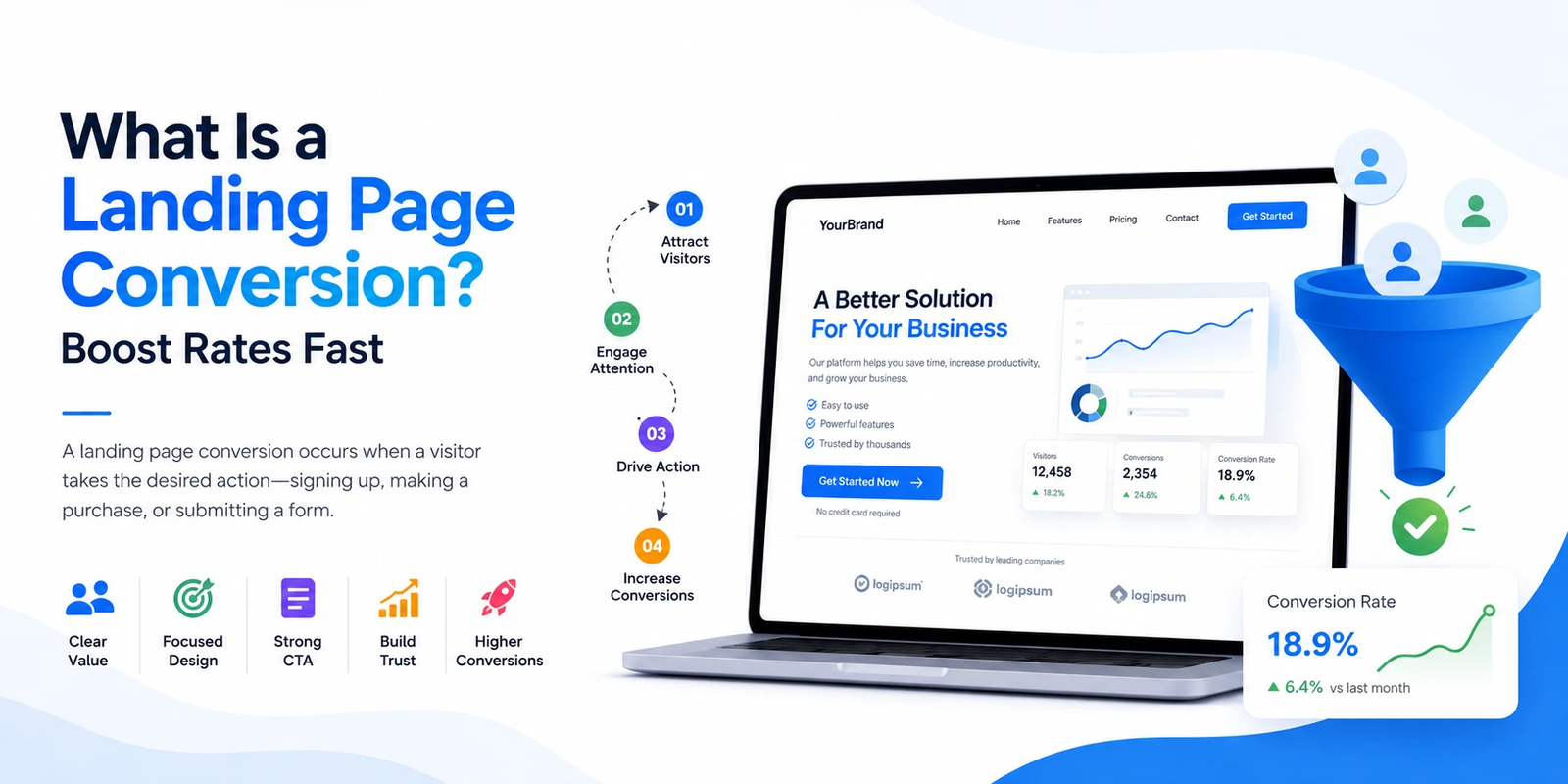
What Is a Landing Page Conversion, Exactly?
A landing page conversion happens when a visitor completes the specific action your page was built around. That could mean making a purchase, submitting their email, signing up for a free trial, booking a call, or downloading a resource.
The key word here is specific. Every landing page should be designed around a single goal. When someone completes that goal, that’s your conversion.
It sounds simple — because it is. The tricky part is creating the conditions that make people want to take that action.
Why This Metric Matters More Than Traffic
Here’s a hard truth: traffic is a vanity metric if it doesn’t convert.
Imagine 10,000 visitors a month with a 0.5% conversion rate. That’s 50 customers. Now imagine 3,000 visitors with a 5% conversion rate. That’s 150 customers — three times the results at less than a third of the traffic.
Conversion rate directly impacts your cost per acquisition, your return on ad spend, and ultimately your profit. Businesses that obsess over conversion optimization grow faster and spend less to do it.
How to Calculate Your Conversion Rate
The formula is straightforward:
Conversion Rate = (Total Conversions ÷ Total Visitors) × 100
So if 200 people visit your page and 8 of them sign up, your conversion rate is 4%.
Track this number weekly. If it drops, something changed — maybe your traffic source shifted, maybe a competitor ran a sale, or maybe a page element broke on mobile. You won’t catch these issues if you’re not watching the data.
What Actually Makes a Landing Page Convert?
There’s no magic formula, but high-converting pages consistently share the same core traits. Here’s what to focus on:
1. A Headline That Hooks Immediately
Your headline is the first — and sometimes only — thing people read. It needs to communicate your value proposition in plain language, instantly.
Avoid clever wordplay. Avoid company-focused statements like “Welcome to Our Platform.” Instead, lead with what the visitor gets. “Lose 10 Pounds in 30 Days Without Giving Up Carbs” works because it speaks directly to a desire.
Match your headline to whatever ad or link brought the visitor there. If your ad promises a free audit, your headline should mention the free audit. Mismatches destroy trust before the page even loads.
2. A Call to Action That’s Impossible to Miss
Your CTA is where the conversion actually happens. Every design decision on the page should lead the eye toward it.
Use action-oriented language: “Start My Free Trial,” “Get the Guide,” “Book My Spot.” These perform better than passive phrases like “Submit” or “Click Here” because they reinforce what the visitor is going to get, not just what they are doing.
Place your primary CTA above the fold — visible without scrolling — and repeat it after key sections of content. Don’t make people hunt for it.
3. Social Proof That Builds Trust
People are naturally skeptical of marketing claims. Social proof short-circuits that skepticism.
The most effective forms include:
- Named testimonials with photos and specific results (“I increased my revenue by 34% in two months — Sarah K., e-commerce founder”)
- Case studies that walk through a real transformation
- Logos of recognizable brands you’ve worked with
- Review counts and star ratings from third-party platforms
- Security badges near payment forms (SSL, money-back guarantees, privacy seals)
Generic quotes without attribution are nearly useless. The more specific and verifiable your social proof, the more it does its job.
4. Design That Builds Confidence
Even if your product is great, a cluttered or out-of-date design conveys to visitors that your brand is unreliable.
Clean layouts with plenty of white space guide attention. Consistent fonts and colors reinforce professionalism. Images should show your product in real use, or show real people with relatable expressions — not generic stock photos of people pointing at whiteboards.
One underrated design principle: remove your navigation menu. Navigation bars give visitors an exit. On a dedicated landing page, there’s only one place you want them to go.
5. Page Speed That Doesn’t Frustrate
Google’s data consistently shows that pages loading in over 3 seconds see dramatically higher bounce rates. Every additional second costs conversions.
Compress your images. Minimize JavaScript. Use a reliable content delivery network. Test your load times on mobile, not just desktop — that’s where most of your visitors are.
Landing Page Element Comparison
| Element | What High-Converting Pages Do | Common Mistake |
| Headline | Benefit-driven, matches the ad | Vague, clever, or brand-focused |
| CTA Button | High contrast, action language | “Submit” or “Click Here” |
| Form Fields | 3–5 fields maximum | Asking for too much upfront |
| Images | Product in use, real people | Generic stock photography |
| Testimonials | Named, specific, with results | Anonymous or vague quotes |
| Load Speed | Under 3 seconds | Uncompressed images, heavy scripts |
The Right Way to A/B Test
Most marketers run A/B tests wrong. They change three things at once and then don’t know which one moved the needle.
The rule: test one variable at a time.
Start with your headline — it has the highest impact on conversion rate. Then test your CTA copy, then your button color, then your hero image. Document everything. Over time, these incremental improvements compound into significant gains.
A reliable A/B test needs statistical significance — typically at least 100 conversions per variant before drawing conclusions. Don’t end a test after two days because one version looks like it’s winning.
Frequently Asked Questions
What’s a good landing page conversion rate?
Industry averages sit around 2–5%, but this varies widely. Lead generation pages in B2B often convert at 1–3%. Niche products with highly targeted audiences can hit 10–15%. Rather than benchmarking against averages, focus on improving your own baseline over time.
How do I track conversions accurately?
Google Analytics 4 lets you set up conversion events tied to specific user actions — like reaching a “Thank You” page or clicking a button. Google Tag Manager makes this easier to implement without developer help. For e-commerce, platforms like Shopify have built-in conversion tracking.
Why is my traffic high but sales are low?
The most common cause is a mismatch between where your traffic comes from and what your page offers. If your ad targets broad keywords and lands on a highly specific offer, the audience isn’t ready. Audit your traffic sources and ensure your page content matches visitor intent precisely.
Does video content improve conversions?
Often, yes — particularly for complex products or services. A 90-second explainer video can communicate what paragraphs of text cannot. That said, video works best when it’s concise, loads quickly, and doesn’t auto-play with sound.
What distinguishes a click from a conversion?
A click means someone showed interest. A conversion means they acted. Clicks are useful for measuring ad performance; conversions measure business outcomes. The gap between your click-through rate and your conversion rate tells you how persuasive your landing page is.
How frequently should my landing page be updated?
Review performance monthly. If conversion rates drop without a clear external cause, run a new test. If rates are stable, test anyway — there’s almost always a marginal improvement waiting to be found.
The Biggest Mistakes Killing Your Conversions
Too many form fields. Every field you add is friction. If you only need an email, ask only for an email. You can gather more information later.
Multiple competing CTAs. “Buy Now” and “Learn More” and “Watch the Demo” on the same page splits attention. Pick one primary goal.
No mobile optimization. If your CTA button is too small to tap comfortably, or your text requires pinching to read, mobile visitors will leave. Test every page element on a real phone — not just a desktop preview.
Ignoring page load time. A beautiful page that takes 6 seconds to load will convert worse than an ugly page that loads in 1 second.
Using traffic that doesn’t match the offer. Paid traffic from broad keywords is expensive and rarely converts. Targeted, intent-driven traffic is harder to get but converts far better.
Putting It All Together
A landing page conversion isn’t some abstract marketing concept — it’s the moment your hard work pays off. It’s a real person deciding your offer is worth their time, money, or information.
Getting there requires clarity in your message, trust built through proof, a frictionless experience on any device, and relentless testing to improve. None of that is complicated. All of it requires consistency.
Start with your headline. Then look at your CTA. Then strip out everything on your page that doesn’t serve those two elements. You’ll be surprised how much a simplified, focused page outperforms a busy, feature-heavy one.
Sources
- HubSpot Marketing Statistics & Trends
- Nielsen Norman Group – UX Research on Conversion Design
- Google Analytics Help Center – Conversion Tracking Setup
- Google PageSpeed Insights Documentation